Android updates aren't usually massive, generational overhauls anymore. They're collections of smaller changes: a cleaner home screen, a more useful multitasking tool, one less tap to do something you've done a thousand times.
Back in the day, this might have been a dot-one update. In 2026, it's a whole new version: Android 17, Cinnamon Bun.
And honestly, some of these little changes are pretty good. These are my five favorites from the publicly available Android 17 software on my Pixel, ranked in my order. If you have a Pixel, these are the sorts of changes to expect soon. If you don't, your timing will depend on when the update reaches your phone. Someday, hopefully.
Quick Summary
- Android 17 focuses on everyday usability improvements rather than a dramatic visual overhaul.
- Screen recording adds a movable selfie cutout, while foldables gain a split-screen gamepad mode.
- The bubble bar supports up to four app bubbles for more flexible multitasking.
- Separate Wi-Fi and mobile data toggles return, alongside more Pixel home screen customization.
Table of Contents
- First, Can We Bring Back the Dessert Names?
- 5. Screen Reactions Are Built Into Screen Recording
- 4. Foldables Get a Gamepad on Half the Screen
- 3. Bubbles and the Bubble Bar Make Multitasking More Useful
- 2. A Collection of Thoughtful Visual Tweaks
- A Quick Detour: Android 17's Easter Egg
- 1. Separate Wi-Fi and Mobile Data Toggles Are Finally Back
- More Small Fixes, Plus Features Still to Come
- The Point of Android 17 Is the Little Stuff
- Sponsor: dbrand's Summer Sale
First, Can We Bring Back the Dessert Names?
No, Google hasn't brought back public dessert branding. I'm just trying to make it happen.
There was something fun about every Android version getting an alphabetical dessert name. Cupcake, Donut, Eclair, Froyo, Gingerbread. Then we got Nougat, Oreo, and Pie. The name itself was part of the surprise.
Then came Q. Fine, I understand why that one might have been difficult. But afterward, the public names stayed numerical.
Internally, though, Google kept the desserts going. The Android version history includes Red Velvet Cake, Snow Cone, Tiramisu, Upside Down Cake, and Vanilla Ice Cream. Then the sequence jumped around: Android 16 was Baklava, and Android 17 is Cinnamon Bun.
There's even a little reminder in the interface. Android 16's system notifications used a tiny baklava glyph. Android 17 has a little cinnamon bun. Somebody at Google still cares. Bring back the public names. It's more fun this way.
5. Screen Reactions Are Built Into Screen Recording
Android 17 makes recording yourself reacting to something on your phone much easier. The screen recorder now includes a Show selfie camera option.
Turn it on, and a live cutout from the front-facing camera appears over your screen. You can move yourself around, resize the overlay, and record everything together.
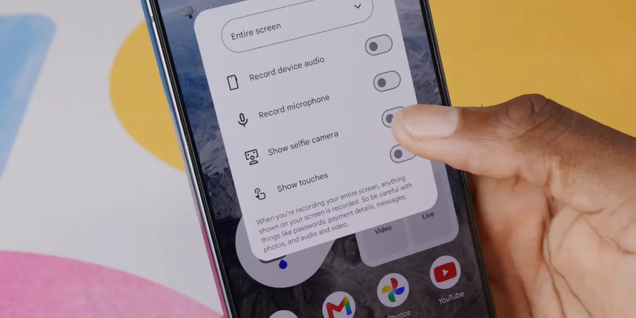
The workflow is straightforward:
- Start a screen recording.
- Enable the selfie camera option.
- Position and resize your camera cutout.
- Record your screen with your reaction included.
I don't normally make this kind of recording, so I can't tell you which dedicated app this might replace for people. Maybe your favorite social app already does it. But having it built into Android removes another step and another reason to find a separate tool.
Convenient. Nicely done, Google.
4. Foldables Get a Gamepad on Half the Screen
This one is very cool, and I'm not even that much of a phone gamer.
Android 17's new foldable game mode lets a compatible foldable divide its display into two parts: the game on one half and an on-screen gamepad on the other. Think Pixel Fold and Galaxy Z Fold-style devices, using that folding screen for something more interesting than just a bigger version of a phone game.
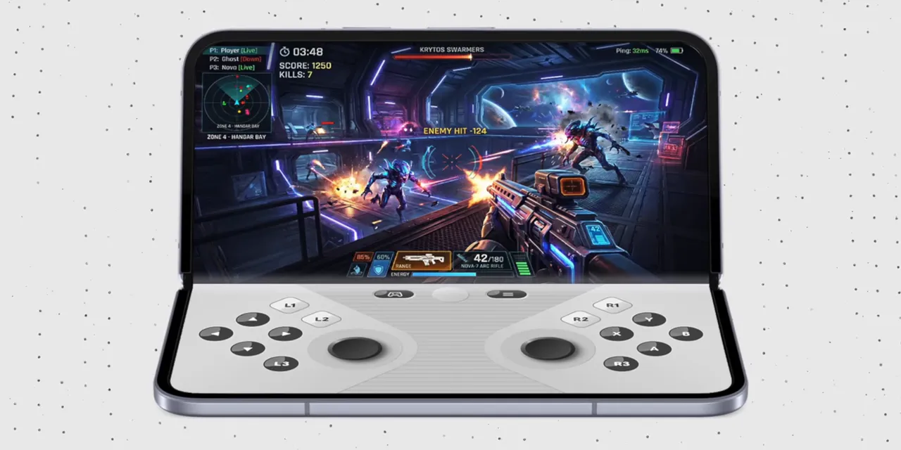
It's a simple idea, but it gives the two halves distinct jobs. The game stays above, and the controls sit below. That's a pretty compelling use of the form factor.
3. Bubbles and the Bubble Bar Make Multitasking More Useful
Bubble bar. It's a good name. I'm going to enjoy saying that.
Floating app bubbles themselves aren't new. Android has supported them for some messaging apps for a while. What's different here is the broader scope: you can launch an app into a floating window, minimize it into a bubble, and keep up to four app bubbles available at once.
The bubble bar becomes a little multitasking hub over whatever else you're doing. Instead of repeatedly switching away from your main app, you can bring up another app in a window and tuck it away when you're finished.
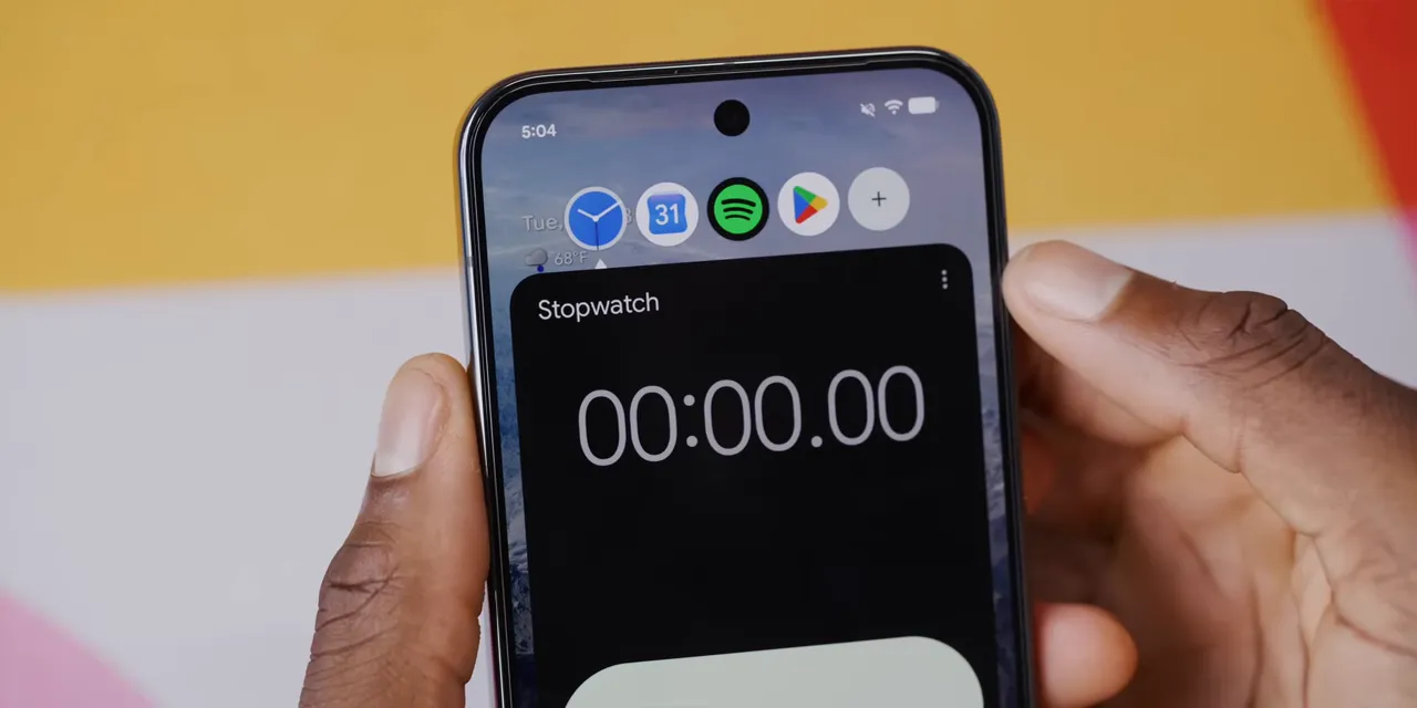
The use case that immediately makes sense to me is taking notes over a playing YouTube video. Yes, manually writing notes. I assume I'm not the only person still doing that instead of asking Gemini to summarize everything.
That combination of a main app and a temporary floating workspace is exactly where the bubble bar feels useful.
There's also a separate but visually related change: screen recording now has a new pill-shaped control at the top of the screen. It isn't one of the bubbles, but it looks like it belongs to the same family. A little more consistency across these floating controls is welcome.
2. A Collection of Thoughtful Visual Tweaks
This isn't a huge redesign. It's not some new Liquid Glass situation. It's more like somebody went through Android and asked, “Which little things could be cleaner, tighter, or more consistent?”
And there are several good answers.
Hide App Labels in the Stock Launcher
You can now hide app labels on the home screen without replacing the stock launcher. If you already recognize all your app icons, removing the text gives you a much cleaner look.
This feels long overdue, but I'll take it.
Less Empty Space in Settings
Some deeper settings screens have less blank space between options. It's subtle, but the previous spacing could feel a little excessive.
This isn't the kind of change that makes a dramatic announcement. It just makes those menus feel more thoughtfully arranged.
A More Consistent Transparent Widget Picker
The app drawer and Quick Settings already had transparency. Now the widget picker gets it too, so a little of your wallpaper comes through while you're choosing widgets.
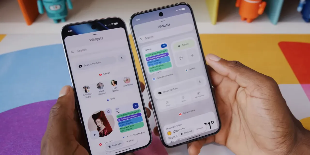
Again, this isn't transparency everywhere just for the sake of it. It's extending an existing treatment to another place where it makes sense.
Choose Apps for Expanded Dark Mode
Expanded dark mode now lets you choose exactly which apps use it, rather than applying it across everything. You can have particular apps consistently open with the darker treatment while leaving others alone.
More control, less all-or-nothing behavior. That's a good theme for an update.
A Friendlier Empty Notification Shade
Android 16's empty notification shade simply told you there were no notifications. Android 17 tells you you're all caught up and adds a little trophy.
Does the trophy change what your phone can do? No. Is it nicer? Yeah, a little.
A Quick Detour: Android 17's Easter Egg
Before number one, there's the annual Easter egg. This year's starts with what looks like a very complicated constellation puzzle.
You tap the Android 17 version entry five times, and a ring of stars appears. At first, it looks as though you're supposed to discover some specific symbol or carefully draw the correct pattern.
You are not. Just connect all the stars together in whatever arrangement you like, and the Android 17 logo appears.
Hold down that logo for a few seconds, and you enter the returning space game, where you pilot a little spaceship around. A fun little distraction, with a much less demanding entrance exam than it initially suggests.
1. Separate Wi-Fi and Mobile Data Toggles Are Finally Back
Thank God.
Android 17 separates Wi-Fi and mobile data in Quick Settings again. No more opening a combined Internet tile and then making another tap just to toggle the connection you actually wanted.
The controls now have two clear actions:
- Tap the icon to turn Wi-Fi or mobile data on or off.
- Tap the text to open the full menu, including the options for connecting to different networks.
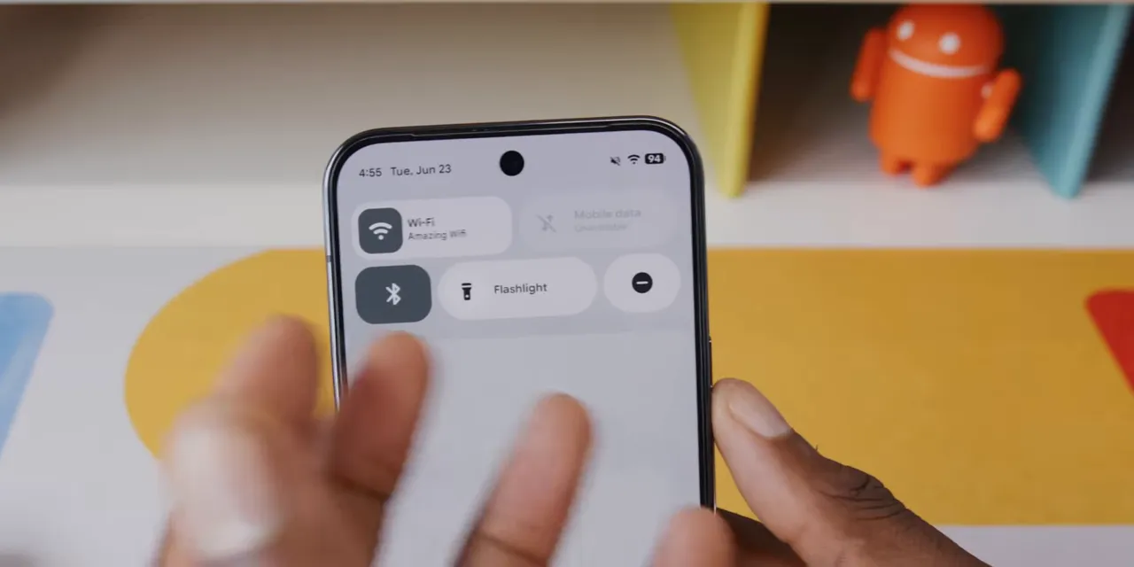
A few years ago, Google combined these controls into one Internet tile. That added an extra layer to something that used to be direct. Android 17 brings the straightforward version back.
Is this the biggest technical change in the entire operating system? Obviously not. But it's my number one because it's the kind of small correction you appreciate repeatedly. It's about damn time.
More Small Fixes, Plus Features Still to Come
The separate connection toggles fit a broader pattern: Android 17 feels like Google is listening to everyday annoyances and actually fixing some of them.
The Permanent Pixel Search Bar Is Finally Customizable
Here's another example. On Android 16, the Pixel home screen has a permanent search bar at the bottom that you can't remove.
There were customization options for search widgets, including transparency and theme color. But those applied if you added a second search widget. Why would I add another search widget just to customize it while the original, unremovable one sat there?
In Android 17, you can long-press the existing bottom search bar and customize it directly, including its transparency and theme treatment.
You still can't remove it. Let's not get carried away. But this is better.
Bouncier Animations and Performance Tweaks
Quick Settings and multitasking have slightly bouncier, more exaggerated animations. There are also smaller performance tweaks throughout the system.
These aren't necessarily reasons to upgrade on their own. Together with the other changes, though, they contribute to an interface that feels a little more polished.
Not Everything Is Here Yet
There's more on the way, and it's worth separating those promises from the features already available on my Pixel:
- Natural-language widget creation: the ability to make new widgets from scratch by describing what you want.
- Rambler: the speech-to-text improvement discussed at Google I/O.
- Pause Point: another tool for Digital Wellbeing.
Widget creation through natural language sounds especially interesting. When that arrives, I think it could be pretty great.
The Point of Android 17 Is the Little Stuff
This update isn't trying to make your phone unrecognizable. It's making familiar things a bit nicer: fewer taps for connectivity, more flexible multitasking, better recording tools, and customization that reaches the thing you actually wanted to customize.
That kind of polish makes me want to switch back to a Pixel again. Then I remember the frustrations that can come with that decision, and I regain a little perspective.
I'm once again hoping the next generation of Pixel phones brings a massive leap forward for Tensor. But I've been hurt before, so I'm not crossing my fingers.
For now, Android 17's strongest argument is simpler: small changes matter when they're attached to things you use every day.
Sponsor: dbrand's Summer Sale
If Android 17 updates the inside of your Pixel, channel sponsor dbrand has options for the outside. Its limited-time summer sale advertises up to 60% off selected items, alongside several specific deals.
- Cases: $10 off, with no code required. The Grip focuses on grip and customizable skins, the clear Ghost comes with a never-yellow guarantee or a free replacement, and the Tank is the rugged option.
- Case and screen protector bundles: $20 off the full bundle. The screen protectors come two to a box, and the installation system is quick and easy. I've used one since launch, and it's barely noticeable on the phone.
- Orders over $50: a free deck of dbrand-themed playing cards.
- Killswitch: $55 off.
There's also the new Steam Machine Companion Cube, discounted by exactly $0. A classic.
|


